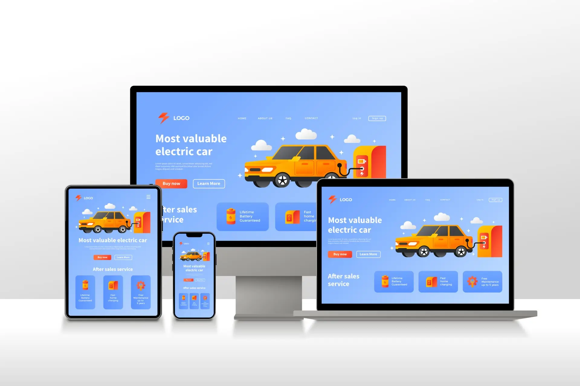
Responsive web design is a hot topic among website developers and designers, and for good reason.
Having a responsive design is essential in today's digital era. You wouldn't want your website visitors to have a poor user experience, which could ultimately harm your business.
Recognising the significance of responsive web design, we've decided to create the ultimate guide on why it's essential for every business.
Put simply, responsive web design ensures your website looks impressive and functions smoothly across all devices, regardless of screen size or type. This means that whether someone is viewing your site on a desktop computer, tablet, or smartphone, the layout and content will automatically adjust to fit their screen size and viewport.
These statistics underscore the importance of responsive web design in today’s digital landscape, emphasising the need for businesses to prioritise mobile optimisation for improved user experience and business outcomes.
Responsive design ensures seamless browsing across all devices, captivating visitors and increasing the chances of repeat engagement. A cohesive experience drives satisfaction, leading to increased conversions and long-term client retention. For instance, a responsive e-commerce site enables users to shop effortlessly on their smartphones, tablets, or desktops, enhancing their overall shopping experience.
With responsive design, managing a single website streamlines updates and reduces resources and time spent on maintenance. Centralised tracking and analytics further facilitate efficient management and optimisation. For instance, a responsive website for a news outlet eliminates the need for separate desktop and mobile versions, simplifying content management and SEO strategies.
Google prioritises responsive design, favouring websites with unified URLs and HTML. This optimisation enhances indexation and sharing capabilities, ultimately improving search rankings and visibility.
Example: A responsive business website ranks higher on search engine results pages (SERPs), driving organic traffic and expanding audience reach.
Responsive design caters to the growing number of mobile users, maximising accessibility and attracting a broader audience. Increased traffic translates to heightened brand exposure and potential customer acquisition.
Example: A responsive restaurant website allows patrons to easily access menus, make reservations, and browse reviews on their smartphones, attracting more diners and enhancing customer satisfaction.
By eliminating the need for separate desktop and mobile websites, responsive design reduces development time and costs. This cost-effective approach maximises ROI while ensuring a seamless user experience across all devices.
Example: A responsive portfolio website for a freelance designer minimises design costs and streamlines content management, allowing for efficient showcasing of work to potential clients.
Here are some insights-
Final Thoughts
In today's highly competitive market, having a responsive design is essential for maintaining a competitive edge. With the increasing reliance on mobile devices for internet browsing, it's crucial to provide users with a seamless and visually appealing experience across all devices. A responsive design ensures that your website not only looks great but also performs reliably on every device, meeting the expectations of modern consumers who demand excellence and mobile-friendly solutions.